
Modeling Pollution in the Great Lakes
02/04/2020
We’ve started a modeling unit investigating pollution in the Great Lakes system.
Today students were set the task of figuring out how much pollution would be in Lake Erie at the end of one year if a a single pollutant was introduced at a rate similar to the levels that that same pollutant was introduced each day in the 1960’s, before strict water pollution regulations were put into place. Because Lake Erie is part of a larger system, students need to account for water flow in and out each day in order to find their answer.
Before doing these calculations, however, we first needed to calculate the volume of the lakes in the Great Lakes system (while we are starting with an exercise involving Lake Erie, we will eventually move to other lakes).
Students were given a map of the Great Lakes and information about their depth. They worked together to find strategies for finding the volume of these non-standard shapes.


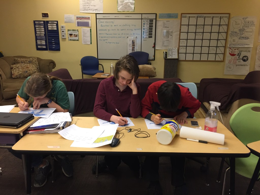
To complete this activity students had to practice unit conversions, as well as calculating the volume of different shapes. As we went over our answers and strategies as a class, students reflected that this was the area that tripped them up the most!
Now that we have found the volume of the lakes, students are using Google Sheets to create their model of pollution levels after 1 year. When this is done, we will see how long it would take the lake to return to safe levels if no new pollutants were introduced, also using Google Sheets.
Fact Checking the Wall Street Journal – A Modeling Exercise
01/15/2020
I started this week by presenting students with the following headline from the Wall Street Journal:
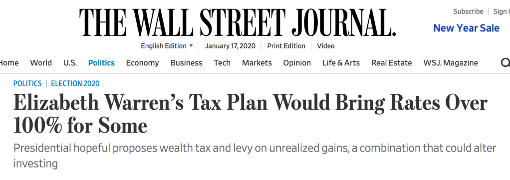
Their task has been to fact check this headline, by trying to model what percentage of their income different earners would be required to pay under Warren’s plan vs. our current system.
In order to do this, students had to first understand how our tax brackets work and learn how to calculate effective tax rate. This was a great opportunity to practice calculating percentages!
Then, students had to figure out what should count towards “being taxed more than 100%”. Should this only include what you’re taxed on your income? What about the proposed wealth tax? If you have money in savings that you’re taxed on, and that savings is greater than your income, should that amount be measured against your income, or a different standard? Different groups made different assumptions about what to include here, and came up with different answers about whether or not this headline was misleading.
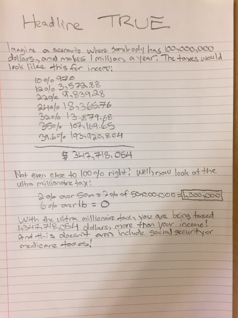
Our next step will be learning to use spreadsheets to model tax income under different constraints.
Measures of Center – Mean and Median
11/26/2019
We’ve spent the past few days of math class exploring mean and median.
To start our exploration, students were given the area of each state in the U.S. and then the total area. They were then asked to determine whether taking the mean or the median of this data would give a better sense of a “typical” state size.
Students debated the virtues of each measure. A few students noticed that the largest state- Alaska- was more than twice as large as the next largest state- Texas. Others noted that because of this outlier the mean was larger than more than 2/3 of the data.
To get a sense of this spread, we learned how to create histograms. Students worked together to decide how they should divide up their categories to get a histogram that was neither a “pancake” nor a “skyscraper”. These histograms helped us visualize just how much of an outlier Alaska was, and gave room to introduce the language of a skewed v. symmetrical distribution.
While mean and median are concepts that most students have seen before, they are important topics to revisit before we move to learn about standard deviation after break- and discussing when each was a better measure of center lead to many interesting observations and conversations!
Correlation and Line of Best Fit Unit Recap
11/26/2019
We’ve wrapped up our investigation into line of best fit and correlation, although these concepts will continue to come up throughout the year. Our line of best fit unit allowed students to refine their skills with linear equations, while extending their thinking into the realm of statistics.
Skills that we’ve covered in this unit include:
- Constructing scatter plots for bivariate measurement data to investigate an association between two quantities
- Determining the explanatory and response variable when examining a set of data
- Articulating patterns in data, including clustering, outliers, negative and positive association
- Fitting a line to data to show a linear trend (both by hand, and using software like Desmos or Excel)
- Understanding the effect that outliers have on how a line of best fit is drawn
- Writing the equation of a line of best fit in slope-intercept form and using this equation to make predictions
- Identifying the direction and strength of a linear correlation between two factors
- Determining the correlation coefficient for a set of data using desmos or excel
- Using correlation coefficients informally to describe the strength of the linear association illustrated by scatter plots
- Understanding the difference between bias and error when sampling data
- Evaluating the pros and cons of cluster and stratified sampling
- Utilizing a sampling method make inferences about a large set of data
Our culminating project for this unit asked students to investigate factors that contribute to happiness using the happiness index score from the World Happiness Report. Students began by making predictions about what things would correlate most highly with happiness to decide what they wanted to explore for this project; common choices included GDP, average life expectancy, and levels of inequality within a country. We then explored how to sample the data; with 157 countries on the World Happiness Index, it did not seem like a good use of time to plot all of those points either by hand or by plugging them individually into desmos. During this exploration we looked at cluster and stratified sampling methods, and talked about the importance of randomness (and how human choice is not random!) Students then graphed their line of best fit and found the correlation coefficient for their data, drew inferences about what factors correlated most highly with happiness, and presented their findings to the class.
These presentations led to many interesting questions about whether or not correlation coefficient changes if you switch your explanatory and response variable on a graph (it does not) and why this might be, what really makes something an outlier, and what an appropriate sample size is.
Our findings suggested that social support and life expectancy are most highly correlated with happiness (of the variables we investigated). One of the most surprising findings was that correlation between peace (as reported on the global peace index) and happiness is almost zero- we thought this would be quite high!
How High Can Ms. Alyssa Jump?
10/22/2019
We began our exploration into lines of best fit by asking “How high can Ms. Alyssa jump?”
Students measured the height of themselves and a partner, and measured how high they could jump. Then, they made a prediction of how high I could jump.
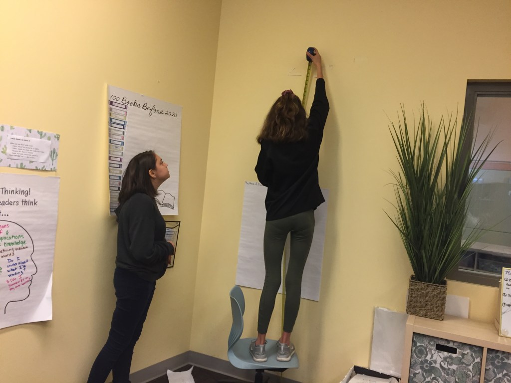
Next we headed out into the community to gather some more data. Students asked administrators, teachers, and younger students to jump for them!
Once we had our data set, students broke into teams to figure out how we could use this data to make a more accurate prediction.

Some groups decided they should try and figure out what the ratio was between each person’s height and jump, and then average those ratios. Others decided to create a scatter plot.
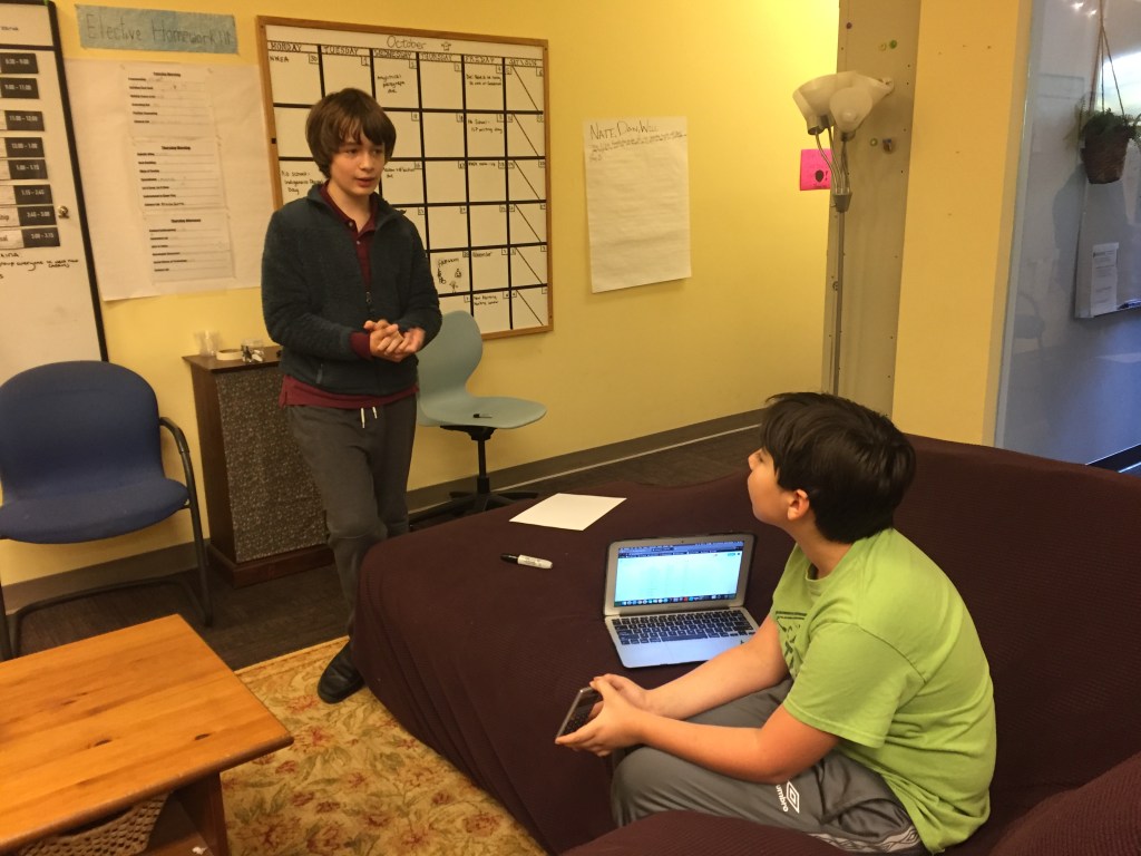
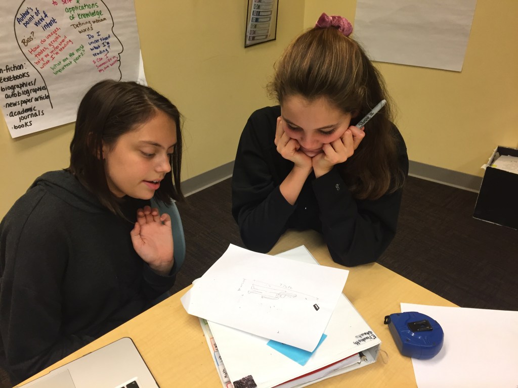
On Thursday we’ll share our results and talk about methods of graphing before introducing the concept of “line of best fit” more formally!

